From broken funnel to crystal clear: Unlocking Onboard's first 10k customers
On Nov. 20th 2023, 2 weeks after we shipped the refactored onboarding flow - Onboard wallet's sign-up rate moved from 6% to 90%. In context, if 400 people anywhere downloaded the app, 360 of them would go ahead to successfully complete sign-up and become an Onboard customer. This is in line with Onboard's mission to break borders and democratize access to quality financial services.
First, by bringing online users onchain.

Due to non-disclosure policies, I have omitted and obfuscated company confidential information in this case study.
Backstory
The Onboard context
Onboard is a protocol that’s creating a globally accessible gateway into the onchain economy via its fast-growing peer-to-peer exchange, intuitive self-custody wallet and reliable USD card that allows customers to spend crypto as easily as cash, in about 160+ countries. With a growing presence, the startup is backed by names like Coinbase, Hashed Emergent, Alter Global and Electric Capital. Onboard’s main value proposition is to ensure that anyone, regardless of their location or socio-economic background, can come onchain and have access to world-class financial services. It was super important that I conceptualized an onboarding experience to match our product ethos – that your access to quality financial services shouldn't be limited by your geographical location.
Challenge
The existence of a single point of failure
When we first launched the Onboard Wallet MVP version, we had a critical problem.
We were losing 90% of our acquired users during sign-up. 9k people downloaded the app in one week and 8.1k would drop off at sign-up in the same week. Brutal! We have designed this novel and interesting wallet product but only a handful of folks were getting to the point of value—also the irony, Onboard having an “onboarding” problem.
It wasn’t immediately obvious what was causing this level of bleed within the funnel. What we recognized was that a secure 3rd party application powered a small but core part of our wallet authentication [1]The Future is Seedless
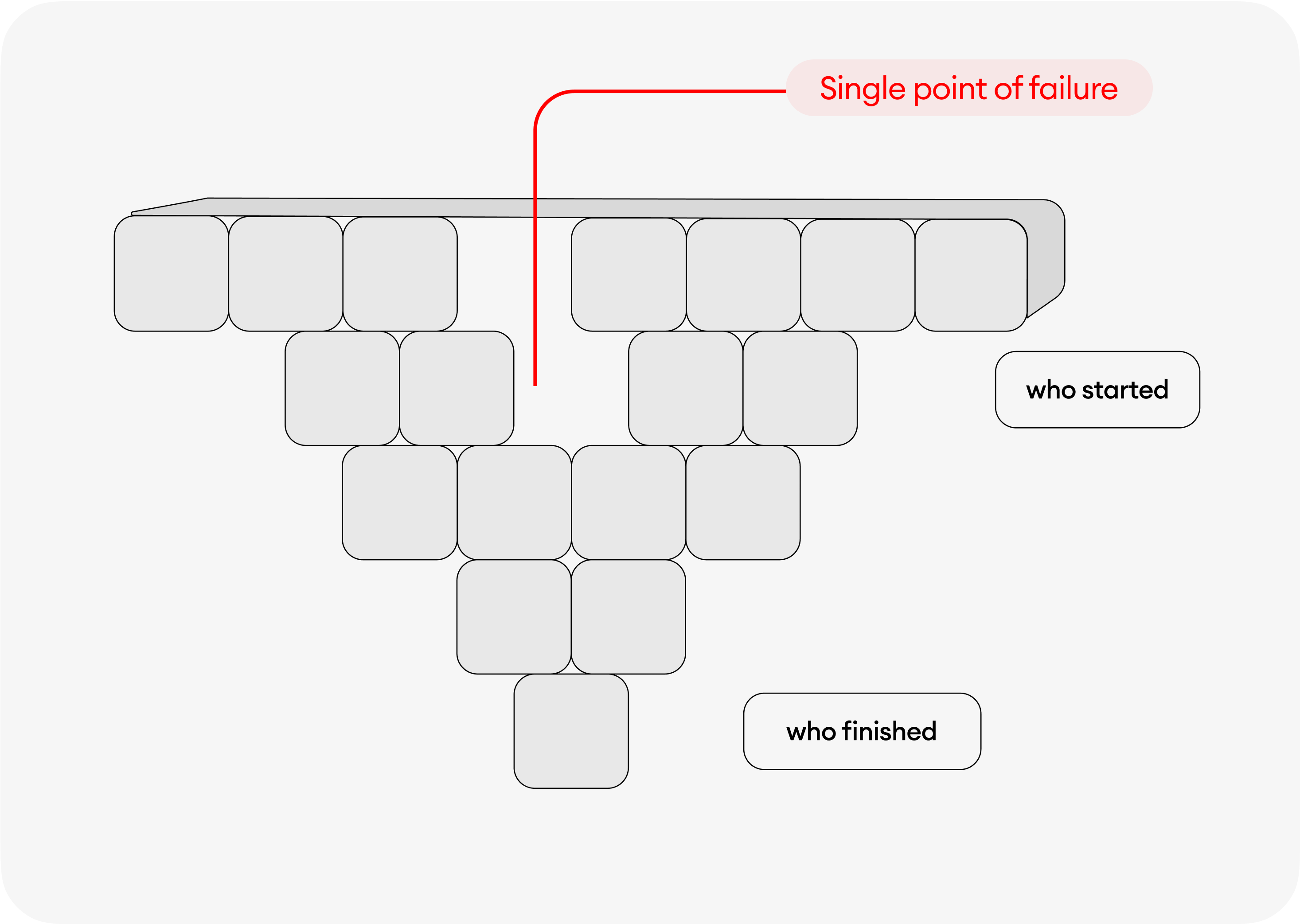 An outline of the broken onboarding funnel from start to finish
Even though that 3rd party authentication service saved us weeks of engineering time compared to building and maintaining auth. ourselves. We soon found our system dependent on this black box we could not control. A single point of failure. All our aggressive marketing efforts fell flat. Customers failed to either onboard at all or early. We had to pause growth spending.
The high-level goals at this point were:
- To minimize drop-off. Moving customer sign-up rate from 6% to about 90%
- To optimize customer experience empowering them with an accelerated time to value
Of course, there were some customer-oriented goals we still needed to uncover. Therefore, we approached this black box with a lot of curiosity, research and product experimentation. First, we took an interesting discovery path that allowed us teardown data in a way that revealed the real root of the onboarding problem.
My Role
Founding designer. Responsible for all things design.
I owned Onboard Wallet’s end-to-end research and design for Onboarding and Account Recovery. It combines the decentralized principles of Web3 with the ease and compatibility of Web2.
Imagine a self-custody wallet account that doesn’t require private keys during sign-up or at any given point - I was responsible for designing this next-gen web3 onboarding experience that does not sacrifice your UX and security.
With Onboard, only your email is required at sign-up [2]The Future is Seedless
As simple as it sounds, this is a really hard thing to engineer and one of the first of its kind.
Since the outset of this project in Sept 2023, I have led efforts that re-architecture the onboarding workflow to address the evolving customer pain points related to their activation experience across iOS and Android.
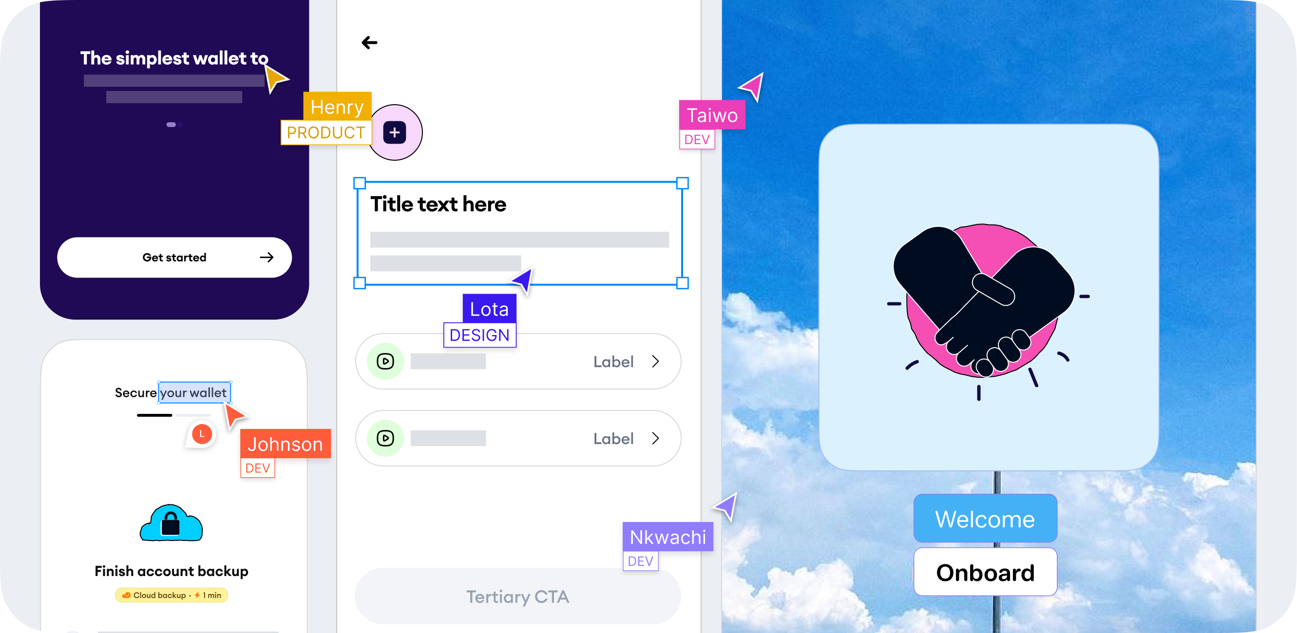
In collaboration with Henry+Serah - Product Taiwo+Johnson+Nkwachi - Engineering Ed - Illustrations Dele - Data
Insights: Looking at Data
Stage 1 – Finding the Bleed - Digging for Our Where
To understand and identify the point of pain for customers, we tore down this black box – the onboarding funnel into stages. Led by Dele our data lead, we formed a granular analysis of the sign-up funnel across iOS and Android platforms. This funnel teardown allowed us to identify the number of users at each phase of the funnel, conversion rates, and WHERE their drop-off points existed.
What we discovered at each phase of the funnel teardown gave us some context we were missing.
Phase 1: From app installation to successful 3rd party auth.
Only 6% of customers who go through the 3rd party service were authenticated successfully. ONLY 6%.
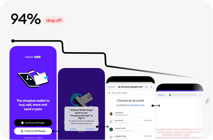 94% drop-off rate from from app installation to successful authentication
Phase 2: From successful auth. to account type selection
Here 85% of our users made it through this funnel. This part of the experience was directly controlled by us. No 3rd party dependencies. At this point, we started noticing a fair conversion rate
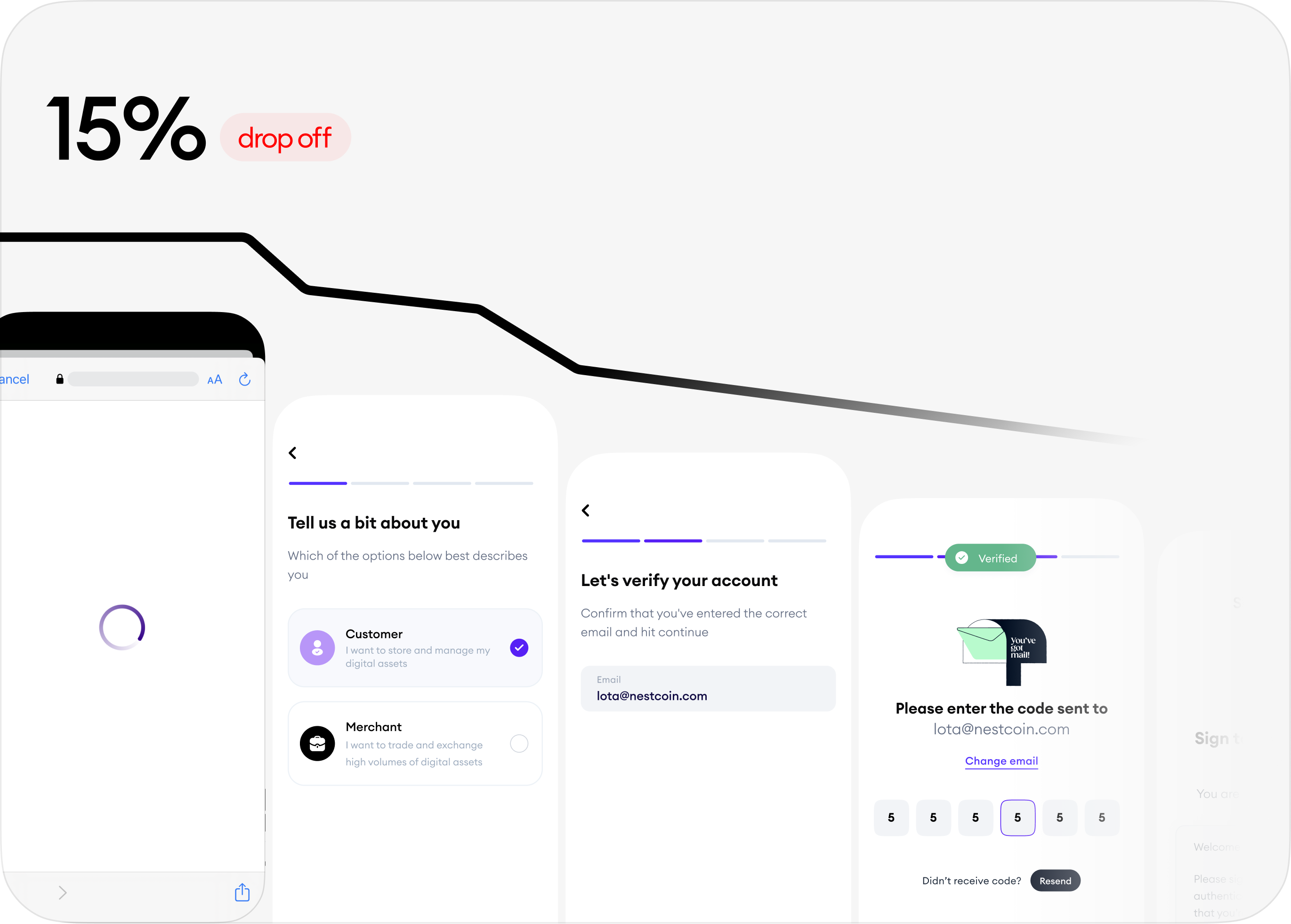 15% drop-off rate From successful auth. to account type selection
Phase 3: From account type selection to creating a passcode
Creating a passcode was the last bit of onboarding and we noticed a near-perfect conversion of 84%. Extremely similar to phase 2. The common theme in both is that we directly controlled that experience. Unlike the experience in phase 1 which was dependent on a 3rd party.
It was becoming incredibly obvious to us that the sign-up bleeding was a factor of something happening within phase 1 that we couldn't see.
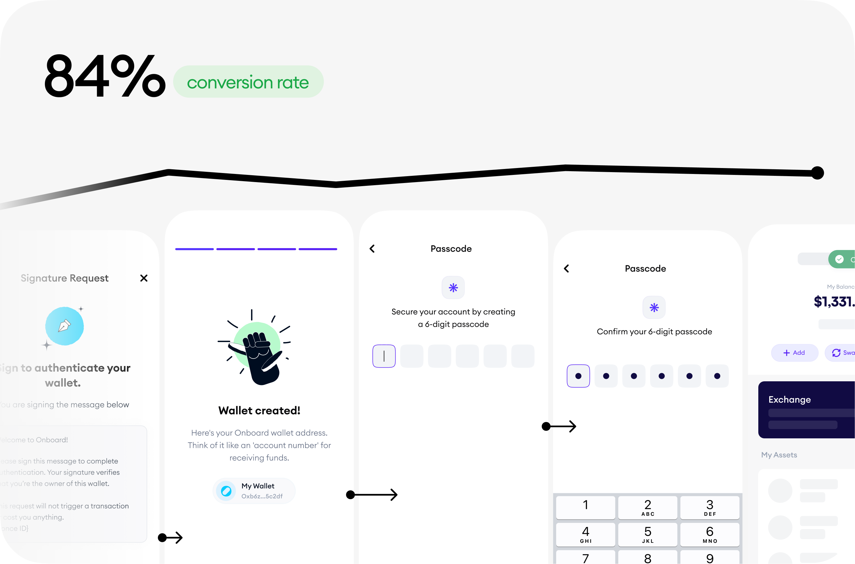 84% conversion rate from account type selection to creating a passcode
Stage 2 – Knowing the Bleed - hearing our What
We surfaced the in-app support entry points early, contextually and clearly since we couldn't figure out on our own, at this stage what was causing this level of unprecedented issues for our customers. Speaking to them was a low-effort attempt to create a clearer picture that eventually helped us staunch the bleeding. These support entry points allowed us to immediately speak to users as soon as they landed on the app or encountered issues during sign-up. The goal was to hear WHAT their friction areas were and how they became drop-off points. Therefore chat support entry points were placed right on the intro screens - the first screen a customer sees when they open their wallet and surfaced as soon as they ran into an issue.
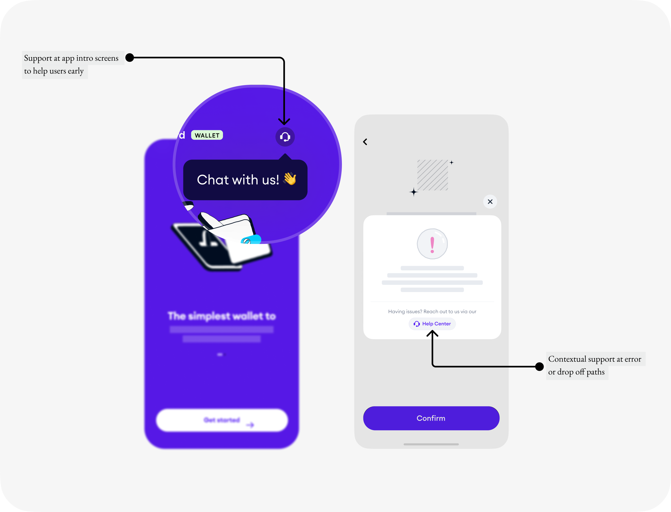 Quick fix: Exposed app support early and contextually for shorter customer feedback loop
 Stage 3 – Confirming the Bleed - Seeing our What
We understood where the bleeding was coming from. We knew what customers were saying. Now, we needed an efficient to see what each customer was seeing without interviewing every one of them. With the help of Smart Look, a powerful visual analytics tool we could quite literally look at securely recorded sign-up attempt sessions from all visitors and customers
The number of auth. errors and high latency we uncovered were disturbing. We could blatantly see points of errors that appeared in Phase 1: From app installation to 3rd party auth.
With this confirmation, We were able to validate the assumptions we made earlier about Phase 1.
Insights: Listening to customers
“ The app does not feel secure, what do these errors even mean?”
In addition to looking into data, I evaluated our customers’ experience by listening to the issues they shared across various channels - our communities on WhatsApp and Telegram and tickets they raised via our support desk.
Below are the insights areas we gathered. They are the key components that will define the first version of our optimized onboarding.

Get me to my money
The 3rd party authentication provider we supported was unstable and unpredictable in the African region. We saw a number of our users complain about unprecedented sign-up errors and delays each time they attempted to enter their wallet. Our biggest cause of worry.

I want to feel safe
Users perceived the app as an insecure environment due to the excessive and ambiguous nature of errors they saw across their account creation experience. This added to the higher drop-off rates even after successful onboarding. We saw comments like “ The app does not feel secure, what do these errors even mean?”

Show and tell
Privacy-sensitive customers were sceptical about creating their accounts via the Apple and Google SSO that we supported. They assumed we had access to their Apple/Google account info. Of course, we cannot - that is the whole point of a self-custody wallet. We needed to cover education gaps and find ways to earn user's trust.
Re-framing the challenge
How might we help customers to confidently get onboard, fast
The presence of a third-party account authentication provider exacerbates the extremely poor conversion rates seen at the top of the onboarding funnel.
The presence of high latency, ambiguous and unprecedented sign-up errors causes low trust and frustration.
A high number of sign-ups unknowingly select a merchant-type account during onboarding which leads to confusion and eventually churn.
This begged the question, how might we empower customers to confidently get onboard, fast?
Our proposal was to focus on speed. Every other thing will fall in place.
We delivered a clear onboarding path and recovery experience backed by infrastructure built by us.
The redesign
Introducing a crystal clear path to Onboard
With the new onboarding redesign, we said goodbye to unclear next steps, multiple points of product entry, unprecedented levels of delay, errors and an unstable authentication experience
Onboard’s new onboarding workflow guides users along a clear path into the product.
I designed a simple, trusted and delightful experience that prioritized getting our visitors into the product fast before anything. From customer authentication to security setup to account backup all in seconds.
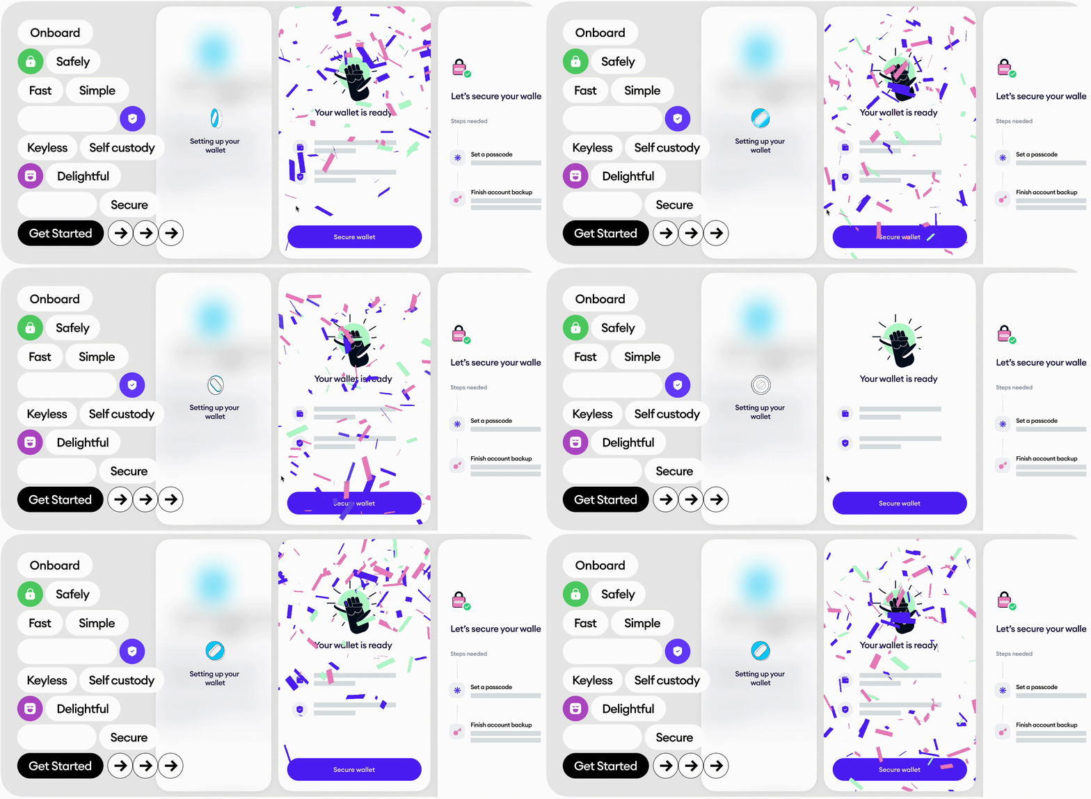
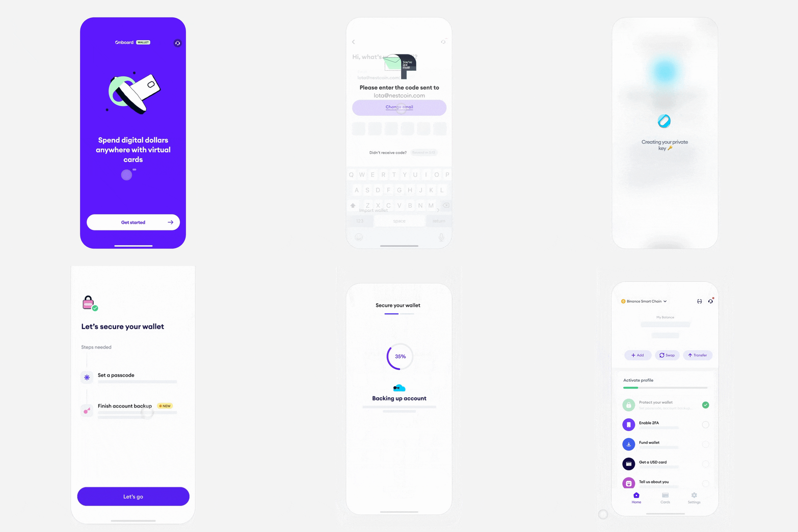 From customer authentication to security setup to account backup all in seconds. Concept design by me. Illustration study by Ed
 Made possible by custom account management rails built by the engineering team led by Taiwo.
A larger segment of our users didn’t care about this technology – They didn’t need to. What mattered today was that they could now get an onboard wallet self-custody account with just their email. We succeeded in shipping an onboarding experience that users perceived as secure, intuitive, accessible and delightful.
Therefore in extension, a strong step towards bringing Web2 internet users on-chain
A single point of entry
I focused on an account creation and recovery workflow that funnelled visitors to a clear, single, reliable point of entry into the app.
The MVP and Initial iterations involved multiple-entry CTAs. Usability tests revealed that they increase the risk of decision fatigue and error paths for customers.
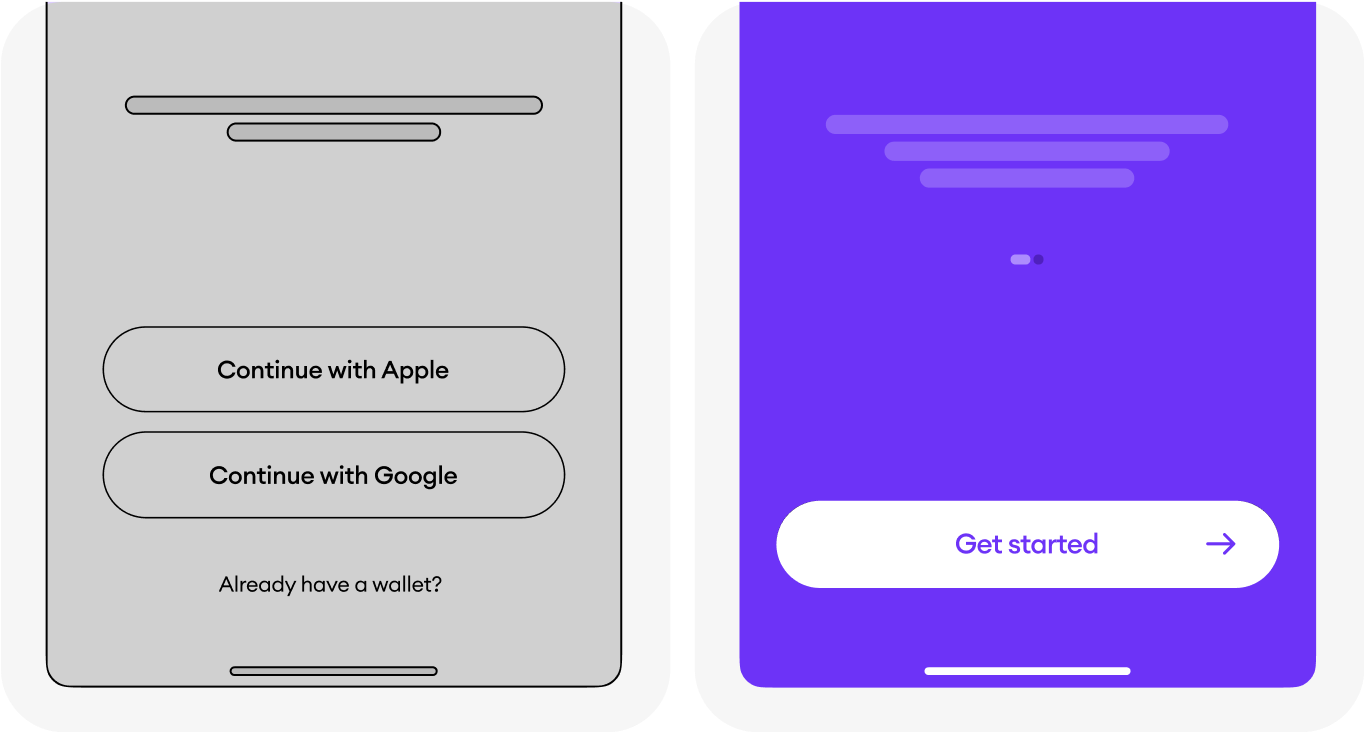 Before and after iterations for app entry. Optimized for simplicity + success
- Before The Initial version had multiple-entry CTAs. Tests show that they increase the risk of decision fatigue and error paths for customers
- After A single point of entry, streamlined decision points and directed customers to success
Skip to the good part
Since we prioritized getting customers into the app as soon as possible, it came with a trade-off. We decided to allow customers to skip account backup - a perceived high-effort but crucial onboarding action focused on user safety. To balance optimizing for both time to value and user safety, I added useful friction to this skip action. This friction educates the user on the value of account backup and forces the user to proceed safely with more intent
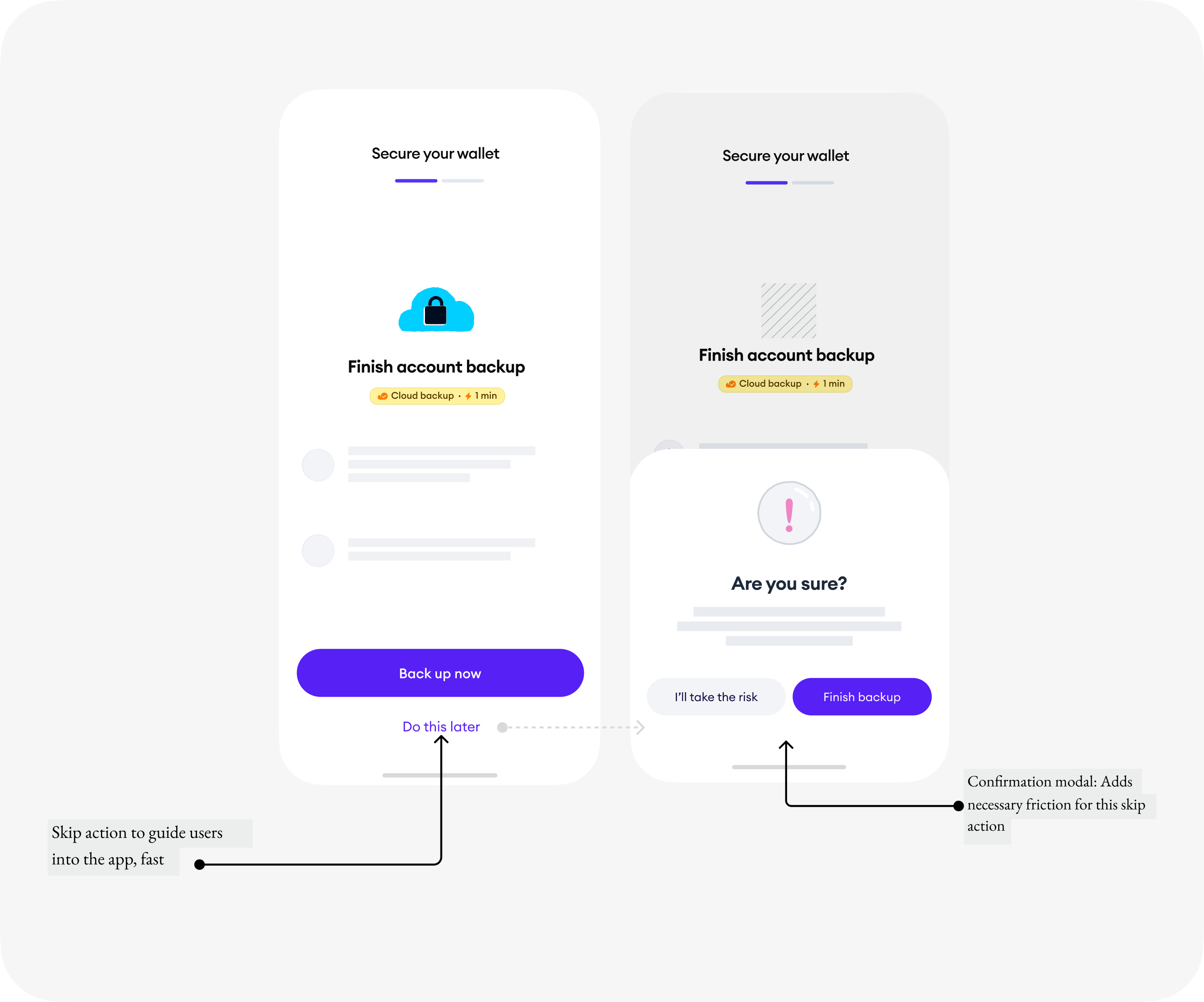 Final iteration of the account backup screen focused on speed and user education
 Get your wallet anytime, anywhere
When I showed participants the initial concept for their account recovery UX during usability sessions, they were immediately worried about the strong password requirements. They feared that they would be at risk of losing access to their funds as soon as they discovered that we could NEVER help recover them.
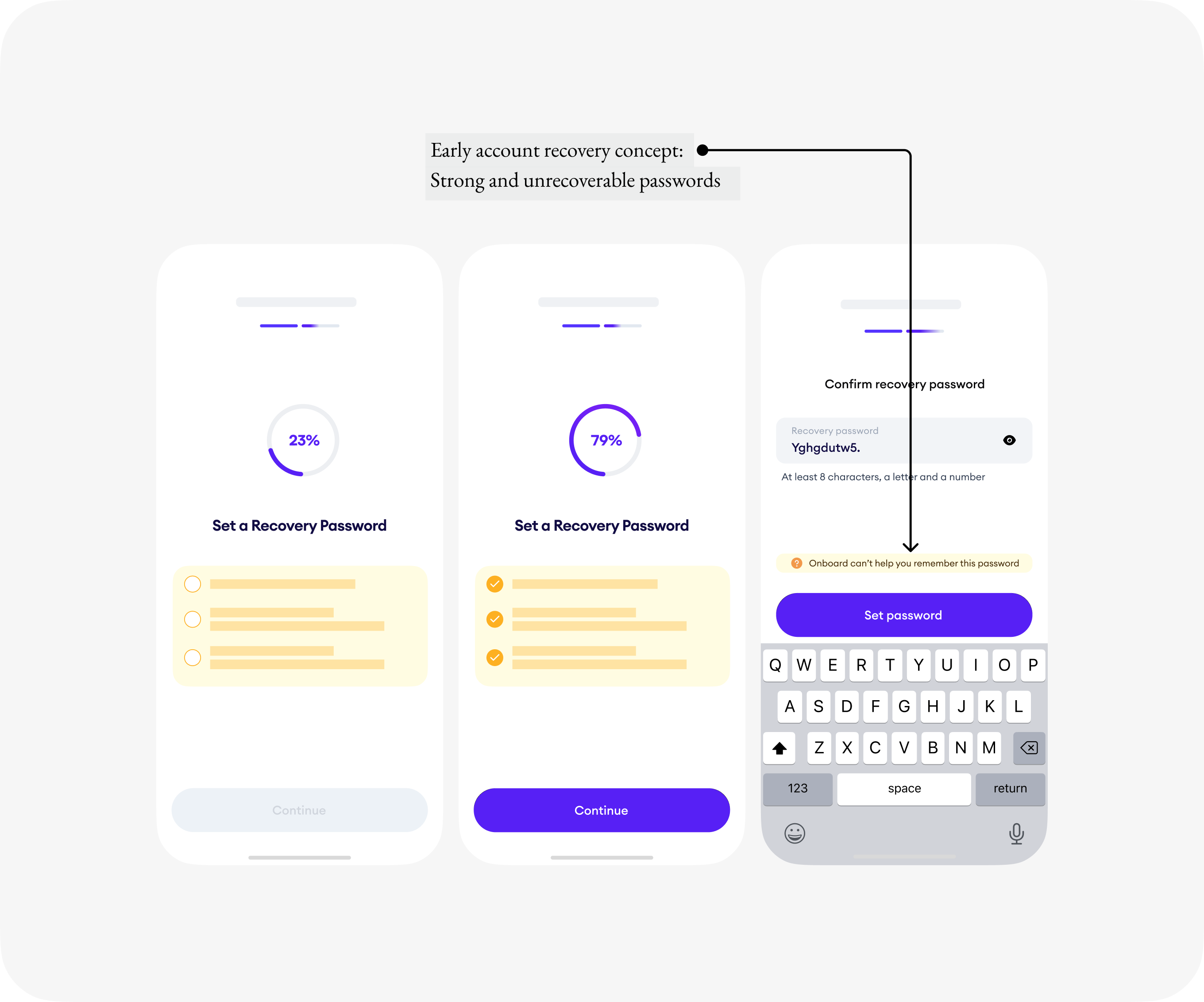 Early UX of the account recovery concept: Strong and unrecoverable passwords
Wallet in the cloud
To de-risk customers, we killed the early concept entirely. I focused on an account security and recovery workflow that supported users to safely regain account access when they back up to the cloud.
“Why do I need to back up my wallet? Where is my backup going to? Is this even secure?”
These are some of the questions that rang through when we tasked customers to back up their accounts during initial usability test sessions. To reassure customers, we slowed things down [2]Labour Perception Bias
People trust and value things more when they see the underlying work. Instead of a one-click instant backup, we introduced interactions and user education that should underlying work. We made it clearer that wallet recovery details were being encrypted to their cloud storage that we didn’t have access to.
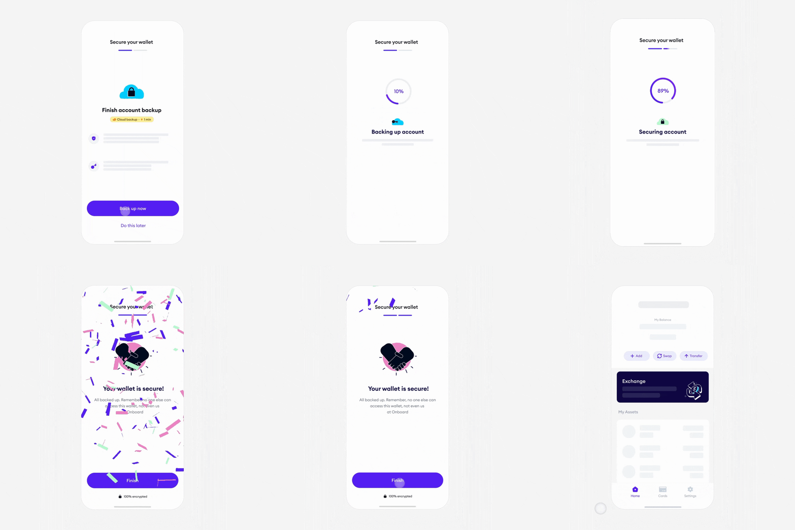 Final account recovery concept: Encrypted back ups and one time passwords
BTS: How we got here
Designing for Precision
One of my biggest challenges was that this project required a lot of precision – a luxury that agile teams usually cannot afford. However, it was a top priority to mitigate customer's exposure to risk. We decided to spend some time mapping out the possible experiences our different customers might encounter during and post-onboarding. Mapping out the possible experiences that our different users might encounter allowed me to pay attention to detail. These primary questions informed my problem-solving:
- What onboarding scenarios and edge cases do I need to cater for?
- What does a precise onboarding flow look like for new and returning customers and merchants?
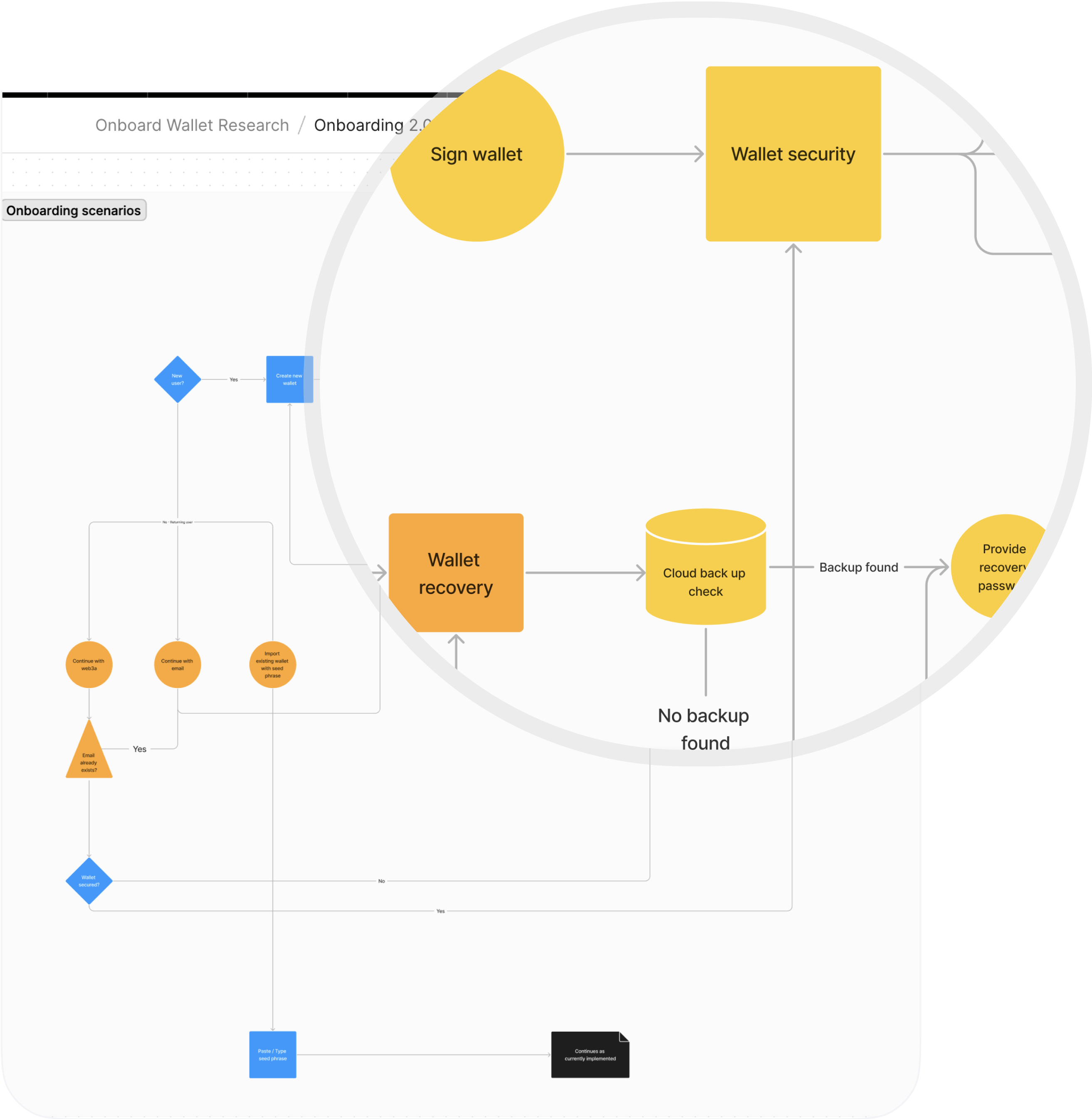 A discarded iteration of the onboarding architecture
Logout scenario
This was one of the pain areas uncovered following the onboarding journey map. I found that in the likely event that customers move to log out without securing their wallet account, they will lose access to their funds. The solution – to run a check that confirms customers' account backup and nudge them along the path to secure their wallet if no related backup is found.
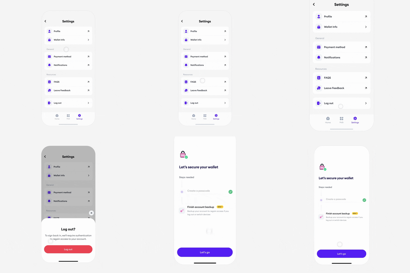 Nudge for users attempting to log out without backing up account
Seamless by default
The existing onboarding system performed poorly, 90% of the time. We needed to move beyond avoiding failure. The goal was to remove it. Crafting an experience that was 99.9% reliable 100% of the time, for all our customers. A seamless by default experience.
I designed and tested earlier iterations of the onboarding flow with 5 participants - new and returning Onboard customers. These usability experiments exposed edge cases and customer expectations that allowed us to optimize more confidently and defined the migration UX required for hundreds of active and funded wallets still on the old version to seamlessly transition to this new build.
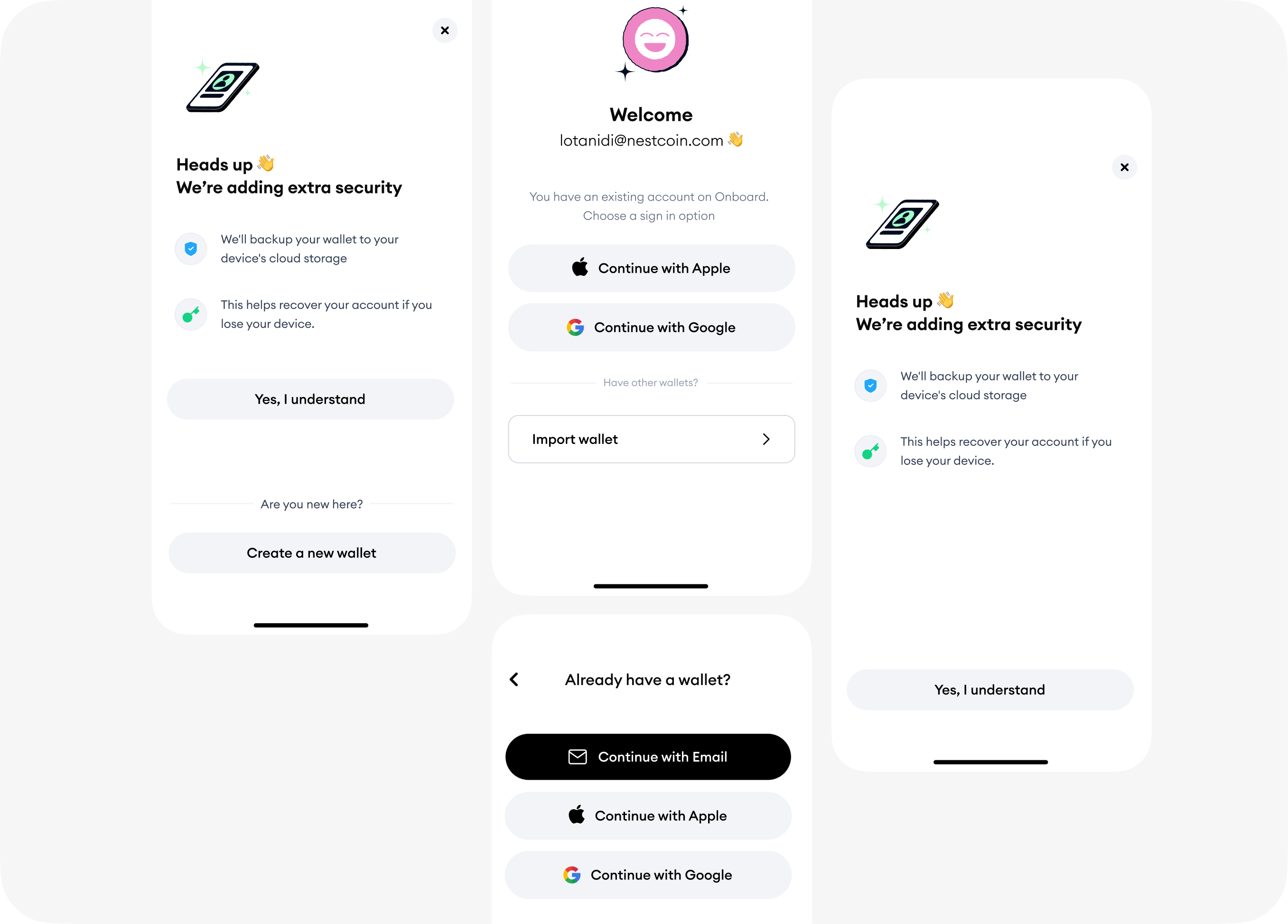 Design iterations: Exploring ways to seamlessly migrate returning users to the new onboarding.
Onboarding first, Activation next
To remove churn, we saved all activation steps for later. This was one of the easiest calls we made throughout this project. It was a direct answer to our challenge: how might we help customers get onboard, fast?
I designed an activation experience – a to-do checklist crafted with the Zeigarnik effect to pull customers into an activation flow.
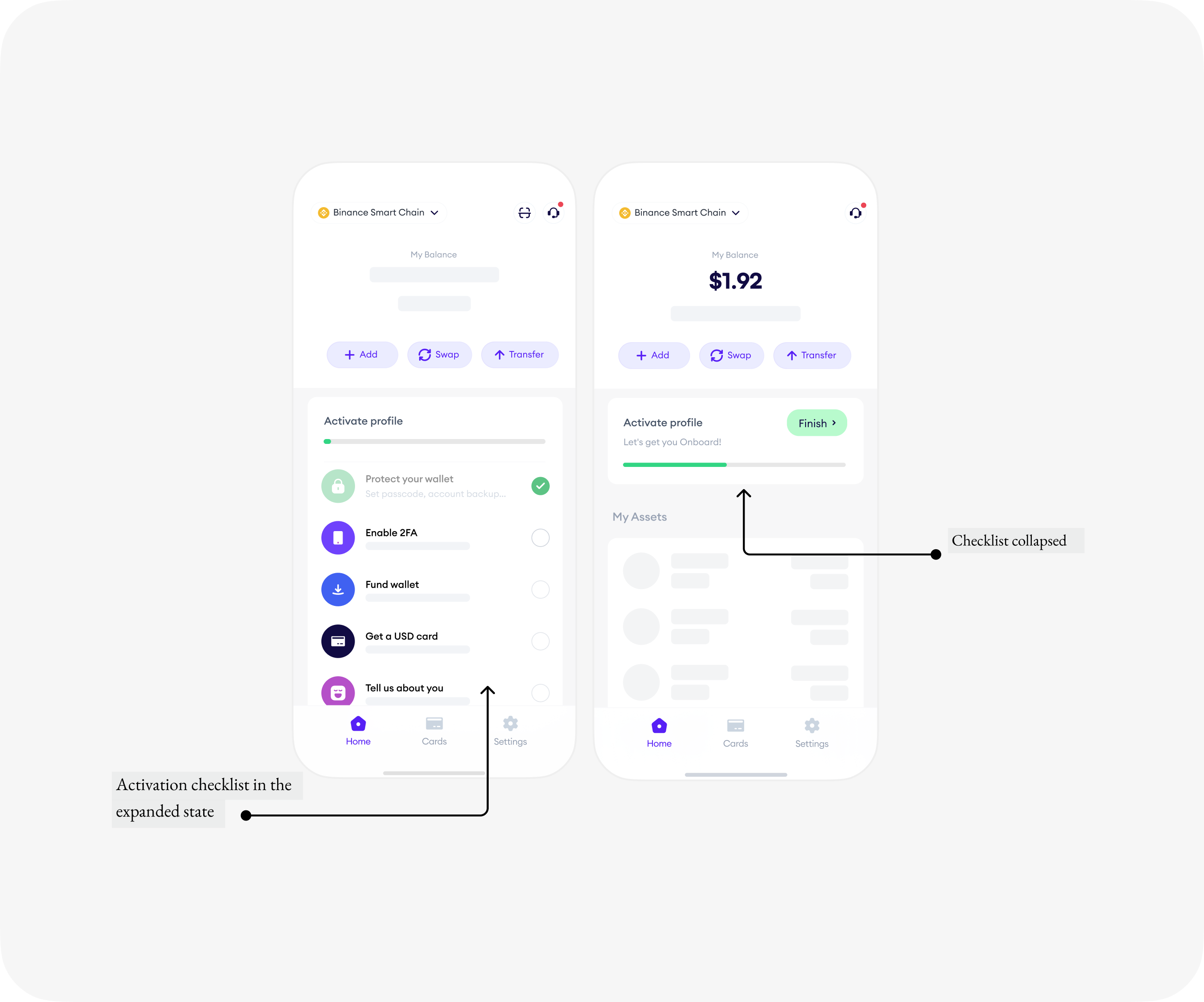 A to-do checklist driven by user intention focused on activation
The Launch
Results, Immediately
- In just 17 days after launch, the onboarding drop-offs recorded were less than 10%. We saw our signup completion rate rapidly grow from 6% to 90.01%.
- We tracked a 22% increase in monthly activation rates, attributable to the optimized onboarding funnel.
- Accelerated time to completion. The efficiency of the new flow was evident as the time required for users to complete the onboarding process decreased by 78%
- Onboarding support tickets for new customers were reduced dramatically
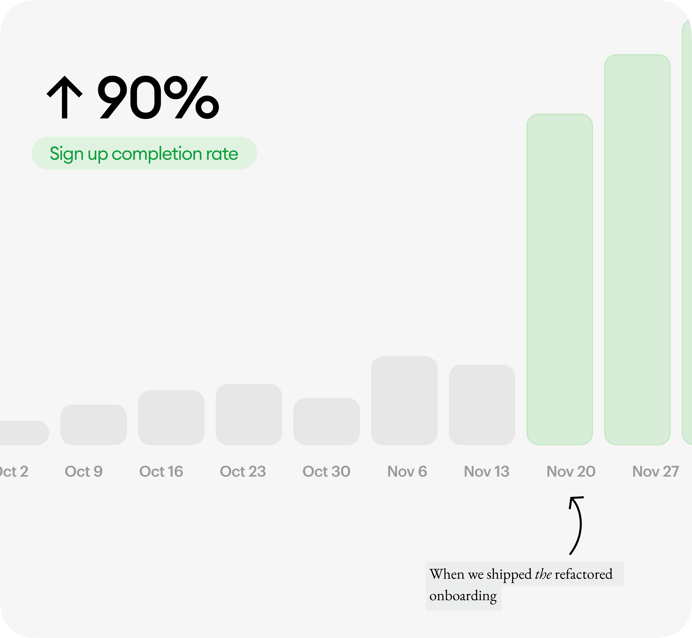 Signup completion rate grew from 6% to 90%.
The Impact
“Amazing, Sleek, Smooth, Simple”
The team had spent countless hours architecting, iterating, testing and re-architecting the onboarding experience in a way that made sense to our customers. It took a lot of listening, empathizing, moving quickly and going back to the drawing board when we learnt something new. Not a smooth process at all but it is this impact that matters to us :)
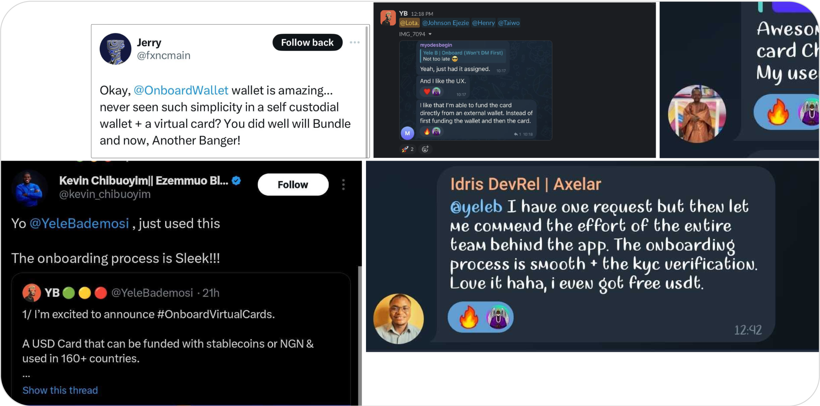 A wall of love
Credits
Cover photograph
–Allan-mas
Product Management
–Henry Uku
Illustrations
–Ed
Data
–Dele Akinyemi
Engineering
–Johnson E, Nkwachi N, Taiwo O
Design
–Lota Anidi